|
|
|
|
|
|
|
|
|
Even
from this vantage point, the most obvious design element
of this museum is this observation tower [below]
- featuring a top heavy piece rising 144 feet high.
With
this piece jutting up from the mostly flat profile of
the rest of the building, it's reminiscent of a battleship.
|
|
|
|
|
|
|
|
|
|
|
|
|
|
Outside,
the building is covered in a copper material, which, upon
closer examination, has been punched with various sized
dents and dimples. [below]
At first
blush, it feels a bit dark and oppressive, but sunlight
causes the walls to change to various shades of umber, rust,
and slate. According to what I've heard, the copper will
patina and change color even more.
|
|
|
|
|
|
|
Walk
in the main entrance, and the stark, austere lobby hits
you like a cold slap in the face.
Somber,
serious, and white -- with the addition of a slightly noisy
fish tank, a stack of outdated magazines, and a Musak system
piping in 'Girl from Ipenema,' you'd have a pretty nice
waiting room.
|
|
|
|
|
|
|
$20.00
for 2 adults, 1 child under 12 is free. 'Please sign in,
the doctor will see you in a moment.'
|
|
|
|
|
|
Very
little assistance from the disinterested staff, but one
security guard with a sense of humor, suggested we head
directly for the observation tower.
So we
did.
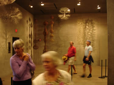
Around
a corner, through a small exhibit of sculptures to wait
for the elevator. Dreary and serious - like an old corporate
office building. [right]
"Michael
Graves, paging Mr. Michael Graves."
|
 |
|
|
Once
to the top, the elevator doors open to a glass observation
tower, providing a spectacular wraparound view of San Francisco,
the Bay, and all those familiar landmarks. [below]
|
|
|
|
|
|
|
Also
on display, a great photo mural of the city [above right].
With the help of a native San Franciscan, we were able to
find the Powell hotel and other landmarks that we had just
visited earlier. The vibe up here was laid-back -- visitors
quietly chatting, some pointing out various places they
knew. Very cool.
|
|
Back
down to level one, we walked to the main foyer and gallery
[below] - more white walls, straight lines, and harsh
florescent lighting. Just not inviting at all.
|
|
|
|
|
|
We
opted for the Chicano art exhibit, which was bright, colorful,
cheerful and a lot of fun.
|
|
|
|
|
|
|
|
|
|
|
|
|
|
|
|
|
|
|
The
gift shop is serviceable. Some fun specific merchandise
for the de Young, but nothing we couldn't live without.
We left
empty handed - unusual for us.
|
|
|
|
|
|
|
Check
our online store
|
|
|
|
|
powered
by 
|
|
|
|
|
|
|
|
|
|
|
|
|
|
Here's
the deal. There's a lot to see at the de Young. Along with
traveling exhibits, de Young also has a large collection
American paintings, African art, textiles and much more.
Our goal was to simply get a flavor for the museum, and
after this short visit, we felt we'd seen enough.
Walking
out, and our feet aching, we opted to catch a cab back to
the Powell, which arrived magically on cue. Driving away,
I took one last glance at the newly opened de Young's observation
tower - sticking out over the trees like a periscope jutting
over the surface of the ocean.
I can't
say that I liked the de Young. With all the great architects
working today, the copper colored exterior, the looming
observation tower, the cold interiors, all make for an unsettling
experience.
Not
welcoming and grand like the Getty
Center in Los Angeles. Not as austere and sterile
as the Museum of Television
& Radio in Beverly Hills -- but it was close.
Not the excitement of Gehry or Graves. And definitely not
the awe-inspiring wow factor of Santiago Calatrava.
The
de Young was, as Mom would say….different.
|
|
|
|
|
|
|
|
|
|
|
|
|
|
|
|
|
|


